Main Content
Design systems can help you design at scale as it is a set of standard reusable components that you can use throughout your platform. It helps make your interfaces look uniform. Plus, when you create different pages, the time of thinking about how big your fonts need to be is greatly reduced, as you have the standard rules already created.
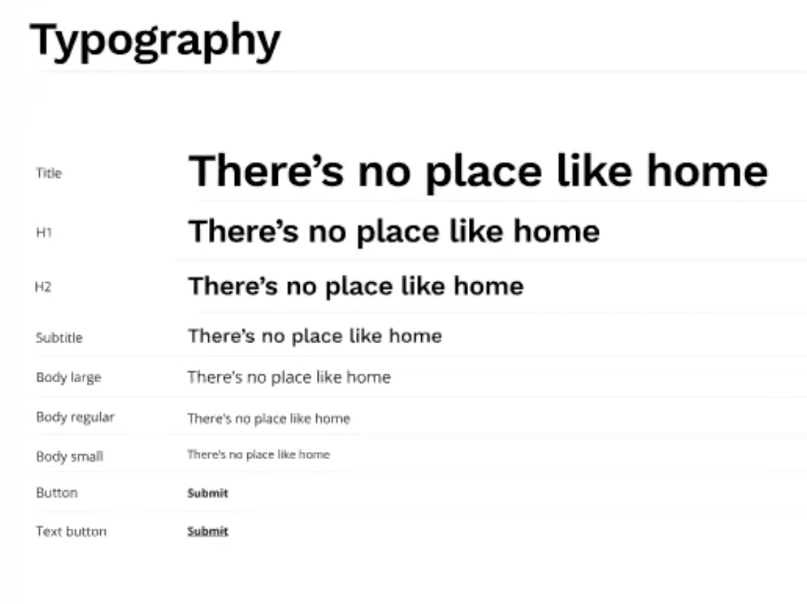
Typography: I learned that you should pick out several text sizes that will be used throughout your interface for ease of communication. Picking out a title size, several heading sizes, and body text sizes will help you present any information nicely. You should also adjust line height and spacing between letters as needed. You don’t want your text to be difficult to read. Text that is too close together gets too cluttered, then people cannot quickly read as quickly. In a design system, you can lay out your different text styles together like the below image. This will allow you to easily see how each style looks on its own and how it looks combined with the others.
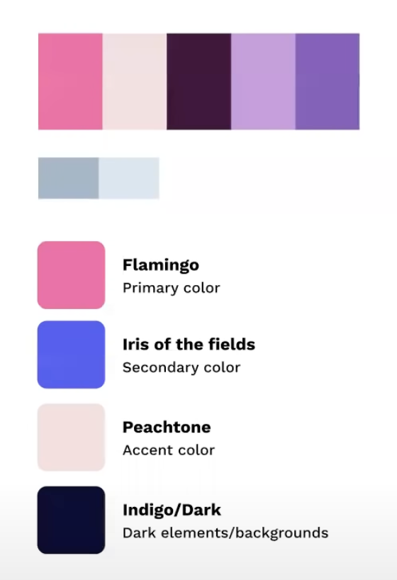
Colors: I learned that you should start off with picking minimal shades. Get your base colors for your website/company down first. Figma can also help with showing you the different shades and hues of a particular color you select. This is helpful, as lighter or darker versions of your base colors can help with visibility of certain features/details.
Citation
https://www.youtube.com/watch?v=EK-pHkc5EL4&list=PLXDU_eVOJTx6ZQswH9nVKVMCsK83OzhoV