Main Content
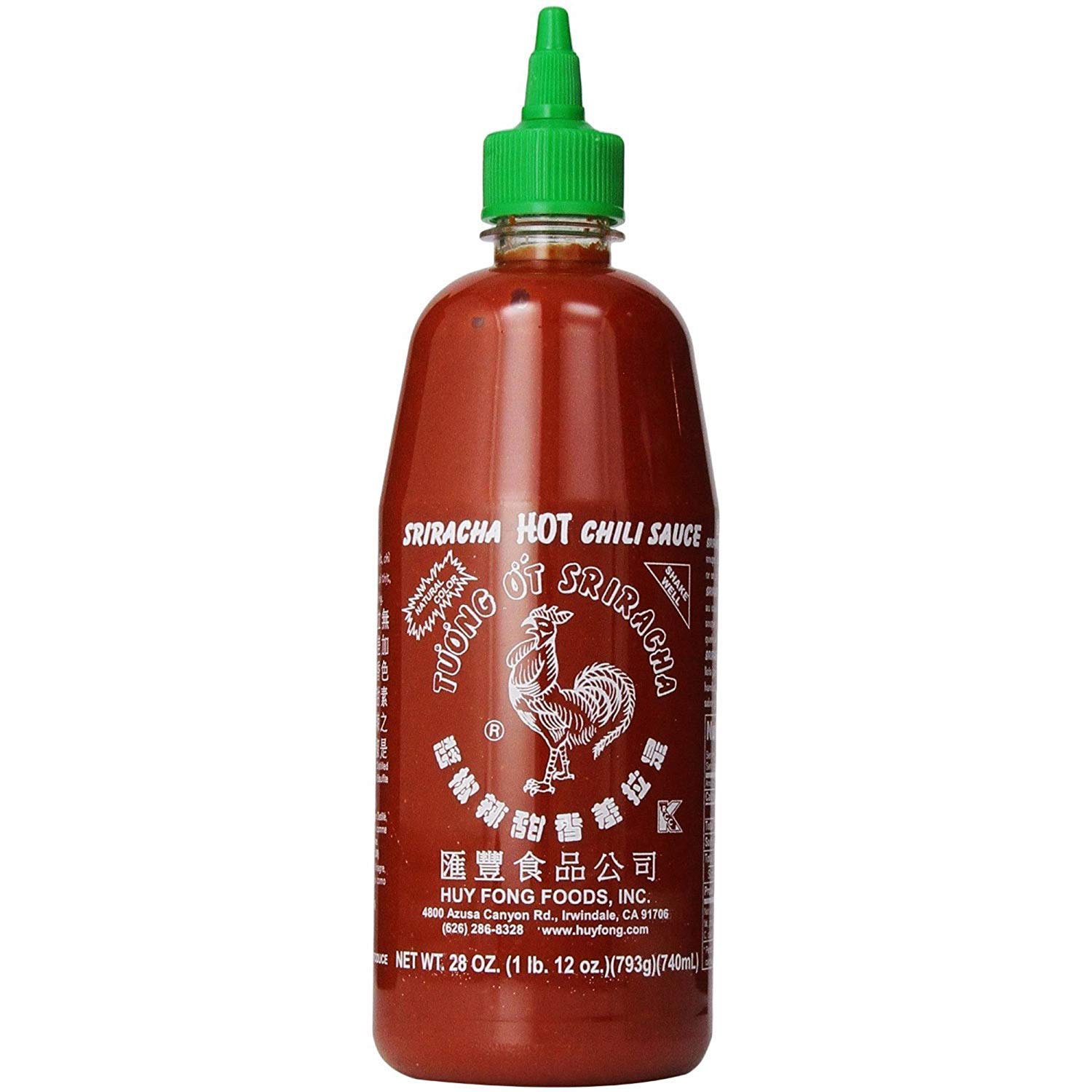
Visual noise is to presentations and displays as hot sauce is to food. The signal-to-noise ratio is the ratio of relevant to irrelevant elements and information in a slide. The higher your SNR is, the better, as that means your content is easier for people to read. Adding a little bit of hot sauce to food can make it taste more flavorful and exciting. Adding too much hot sauce can make the food painful/too spicy to eat, and you can’t taste anything but the sauce. This is similar to SNR. Adding some visuals to your displays/slideshows will make them more interesting, however adding too much will make the main content harder to clearly see and understand.
The SNR concept is important for me to remember in my career, as I make presentations often. Some points the reading mentioned were not using 3D graphics or adding background images/unnecessary data when presenting graphs because the main information can get hidden. Not including logos on every slide is a great way to make the slides less busy, as they mostly just create clutter and make the presentation seem like a commercial. Reducing the amount of text / bullet points on slides is also a great tip, as the audience will mostly just want to listen to the speaker. The slides should just be supporting what the speaker is saying in a nonobtrusive/cluttered way. These tips also apply well to any user interface, such as websites (which I will likely work on in my career). I definitely use bullet points with a lot of text in my slideshows and old websites, so I will keep the tips in mind to reduce the clutter of my interfaces.
Citation
Reynolds, Garr. Presentation Zen. New Riders, 2012.