How I Addressed Design Requirements
Throughout the creation process of my portfolio, I’ve taken steps to make sure it is a quality page and represents me as a designer. The below categories are all qualities I’ve tried to incorporate into my portfolio. I’ve written explanations on how I addressed these design requirements.
Clean, intuitive navigation: I made a nav bar that is accessible on every page. To make navigation easy, this nav bar has only the main sections written on it: My Work, My Studies, and About Me. Within each main section, there are more subsections related to it. They can be easily found by hovering over the main section name. Each of these subsections contain blog posts that belong within the category name. I also followed a typical website convention that the top left part of the website is the logo/name of the webpage. Clicking on it leads back to the homepage.
Intentional color choices: I used about 7 colors throughout my portfolio. I chose a dark purple shade to be the color of the nav bar, and a darker shade of purple to be the color of a selected element in the nav bar to show the user which page they are currently on. This darker shade of purple is also the color of all my buttons, to make them stand out among the lighter background. I turn all my buttons and the subsections in the nav bar a medium-light shade of purple when a user hovers over them. This helps users recognize that the element is clickable and that they are currently over it. I used darker grey/black shades for my text and title sections, and white/off-white for my backgrounds. I selected a handful of colors which I intentionally used for specific elements throughout my portfolio.
Harmony between affordances and signifiers: Things that are clickable, such as buttons or titles on blog post boxes change color when the user hovers over it so the user knows that they can click it/perform an action. Links are blue so the users know they can interact with it. The mouse cursor also points when the user hovers over something that is clickable.
Some consideration to accessibility: I implemented alt text for all of my images. I made sure to make the alt text as descriptive as possible – describing the main objects, what the people were doing, what words were on the image, etc.
Usability elements to help make content easier to digest: I made sure to use appropriately sized html header tags. I made sure I had titles for each blog post and smaller subtitles throughout the post to make sure the reader has a good idea of what sections are coming next. For blog posts like The Trunk Test, I made sure to use numbered lists to make it easier for users to see the description of each element and follow the steps.
Proper Attribution of Others' Work: I made sure to include citations on the bottom of each blog post if I used information from a book or website.
Intentional integration of your values: one of my values is clarity. Before, a lot of my blog post box titles were just what chapter numbers I had to read for the post. When I am on different websites, I like being able to quickly skim titles to find the content/topic I’m looking for. I realized that any new user would likely not be able to do that on my portfolio. I made sure to change blog post titles to be more descriptive and related to what the content of the post is. That way, anyone can get a good idea of what my post is about before clicking/reading it. Another value I integrated was honesty/openness. My goal for my portfolio posts was to allow readers to see how I think and learn about me. In several of my posts, I try to incorporate my thoughts about the reading or bring in details from my personal life. For example, I talked about an art project I did in 8th grade for a color study post. In another, I talked about Initialize, a student club I was president for after I learned about design systems. In my About Me page, I was also open about my initial struggles with CSS.
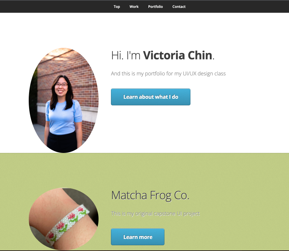
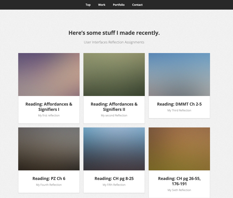
Evidence of Evolution: Before, all my blog posts were on one single page, as shown in the below images. Throughout the class, I learned so much about navigation rules, the trunk test, and colors. After better understanding these concepts, I was able to work to integrate them into my portfolio and improve how my site looks. I added a nav bar with sections that better applied to my content, organized my posts into separate pages, made a consistent unique color scheme, and improved blog post titles/added photos on the boxes.

