![Initialize logo. Says [INIT] Initialize UNL. INIT is also on the left written on keyboard keys](images/initlogo.png)
Main Content
These four articles written by Figma offered guidelines on making interfaces consistent and more visually pleasing. Typography, or fonts, are a very important aspect of an interface, which should be the same throughout the site. The article mentioned considering how many weights or variations of the font you’d need to create hierarchies on pages. Only choosing a handful of variations is best, so that your page isn’t chaotic and all over the place. Keeping record of font-sizes, title and sentence case standards, spacing, and common vocabulary can help designers in the future keep their page designs consistent with the older pages.
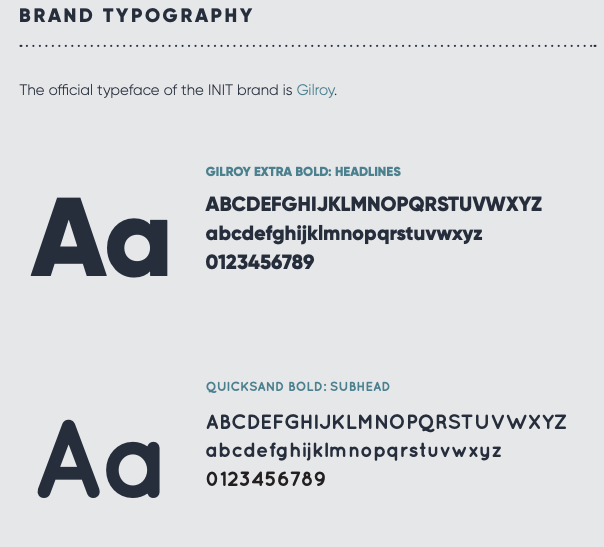
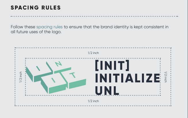
I run a student club for Initialize, and we have a brand book that helps us keep our posters, social media posts, website, etc. consistent with each other. In our brand book, we keep track of specific fonts, colors, and logo spacing standards. We refer to our brand book whenever we need to create new content for Initialize, and this helps us keep a consistent, clean look throughout all in-person/online platforms. This brand book is an example of the guidelines mentioned by Figma that I use often!