Main Content
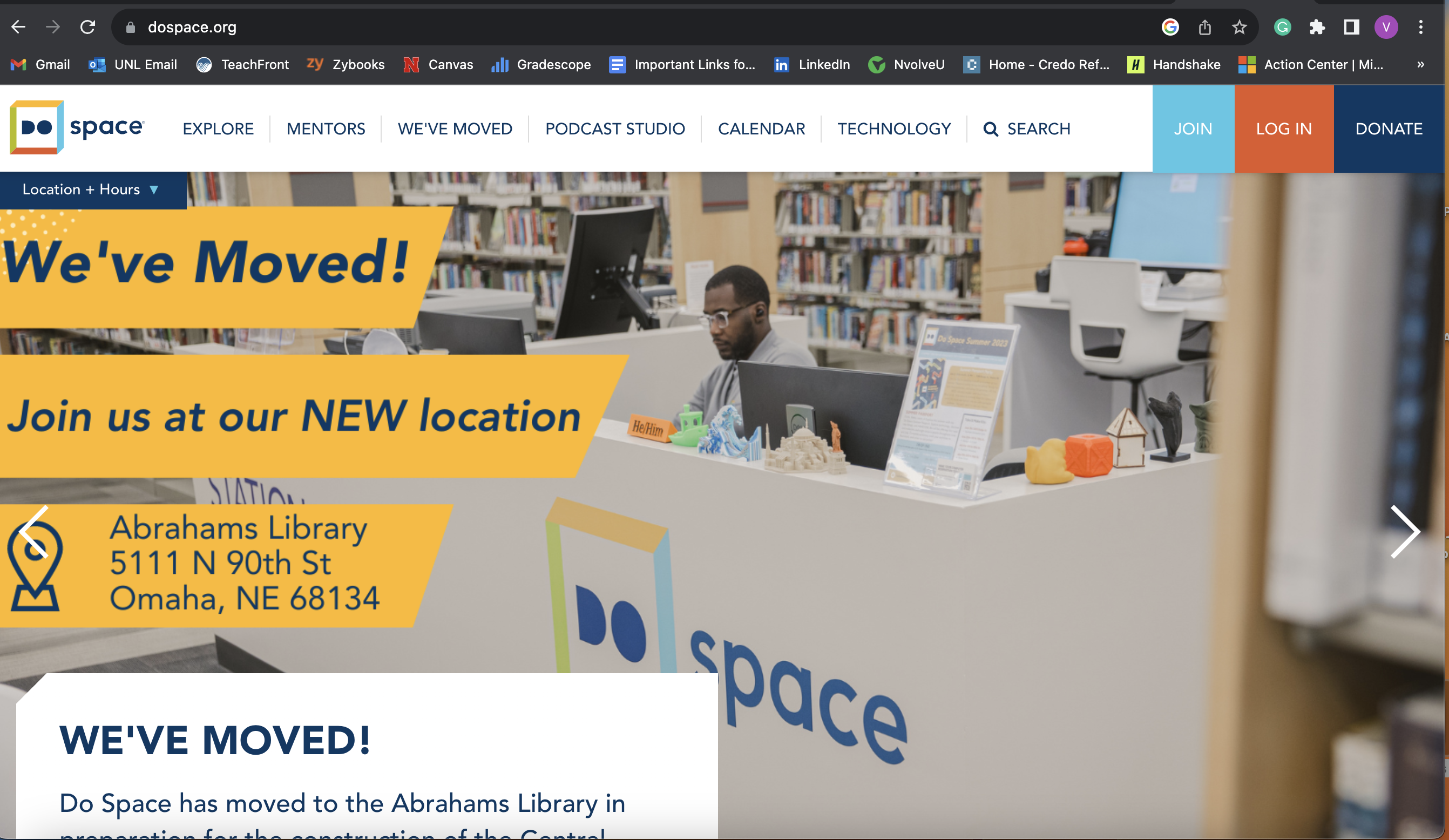
From reading chapters 2, 3, 4, and 5 of Don’t Make Me Think by Steve Krug, I learned about several website design rules and guidelines. Krug states that users often don’t look through every line of text on a website. Instead, they skim through and look for key words that look important or related to what they are searching for. Users are always in a hurry, so we should design to accommodate that. Following the existing conventions, group related content together, make clickable things obvious, and keeping paragraphs short are some of the ways we can do this. My interface example is the DoSpace homepage. It is a good example of the guidelines offered in the reading. The important notice about the location change is in big text and highlighted so that it’s immediately noticeable. It also follows some existing conventions. The toolbar on the very top is just like a lot of existing ones: It shows a lot of clickable categories that users can click on to get more information. The down arrow next to the ‘Location + Hours’ box lets the user know that they can click on it to show more information about when they are open. There is not too much text right when you open the website, so users are not overwhelmed and can easily glance to see where they need to click next. The DoSpace logo is also on the top left, which is another conventioned followed.
Citation
Krug, Steve. Don’t Make Me Think, Revisited: A Common Sense Approach to Web Usability. New Riders, 2014.