Main Content
I am summarizing the “Why Golden Geese make such tempting targets” section as the word, “restraint.” This section is about how the Home page is the best place to promote important information, as it is the most visited page on a site and gains a lot of traffic. Because of this, there may be a temptation to promote everything on the Home page. However, “restraint” should be exercised as too much clutter will result in an overall loss of effectiveness of the Home page. The site would be too busy for any one section to be clearly noticed by visitors. You should stick to the main, most important things to be advertised and put them on the Home page and leave out anything else. This concept is important for me to remember in my career and as I design interfaces so I remember to put the main things I want users to notice on the Home page, but exercise caution and don’t overwhelm my users by putting too much information there.
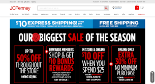
The image pictured above is an example of a cluttered homepage that should limit the number of notices they have. It is overwhelming to look at, and the news about each sale blends in with the others.
Citation
Krug, Steve. Don’t Make Me Think, Revisited: A Common Sense Approach to Web Usability. New Riders, 2014.