Main Content
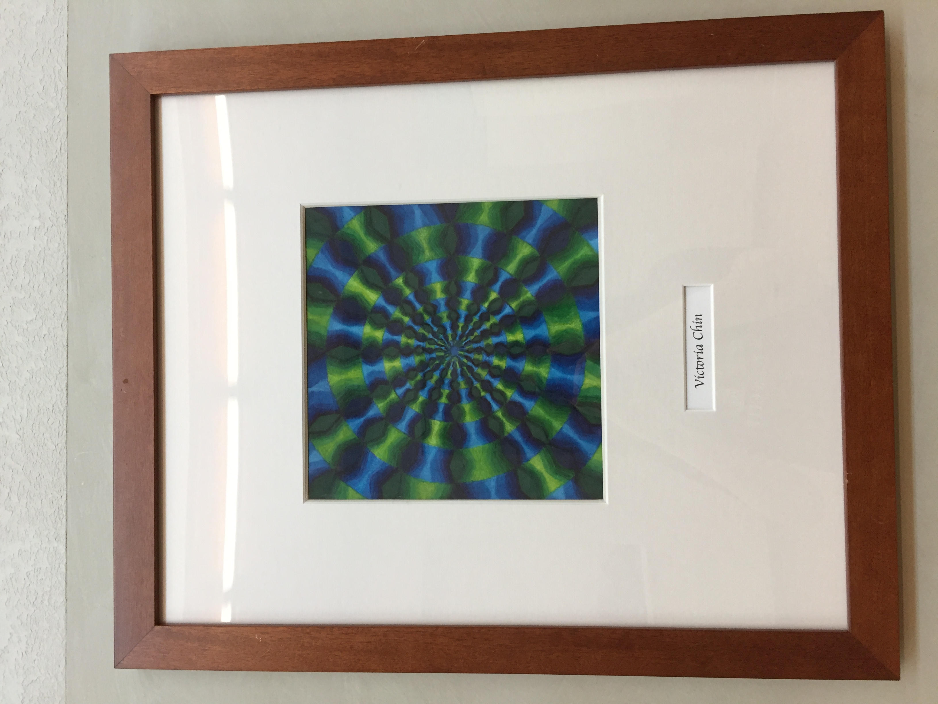
As the book, Color Harmony, mentions, colors can have a big impact on our emotions and how we perceive things. Johann Wolfgang von Goethe, a German writer and philosopher, mentioned the following about green: “The eye experiences a distinctly grateful impression from this color” (Eiseman 11). Green is a relaxing color to look at. To me, it reminds me of nature and how going outside for a walk can be calming. “Blue, green, and purple cool things down as they connect in the mind’s eye with broader expanses of sky, sea, foliage, and outer space” (Eiseman 17). When I read this in the book, I immediately thought about an old art project I did in 8th grade (pictured above). It was an optical illusion design, so that when you stare at the middle of the circles, the triangular slices of the circles look they’re jumping at you. My art teacher had commented that my color choices (the rich greens and blues) combined with the illusion design gave her a calming feeling. Although I didn’t select the colors to intentionally give viewers a feeling of relaxation (I just picked blue and green because I thought they looked nice together), I saw what my teacher meant. When I look at my piece now, I notice a slight calm feeling that comes over me, and I firsthand can feel the power of color.
Citation
Eiseman, Leatrice. The Complete Color Harmony - Pantone Edition: Expert Color Information for Professional Results. Rockport Publishers, 2017.