Main Content
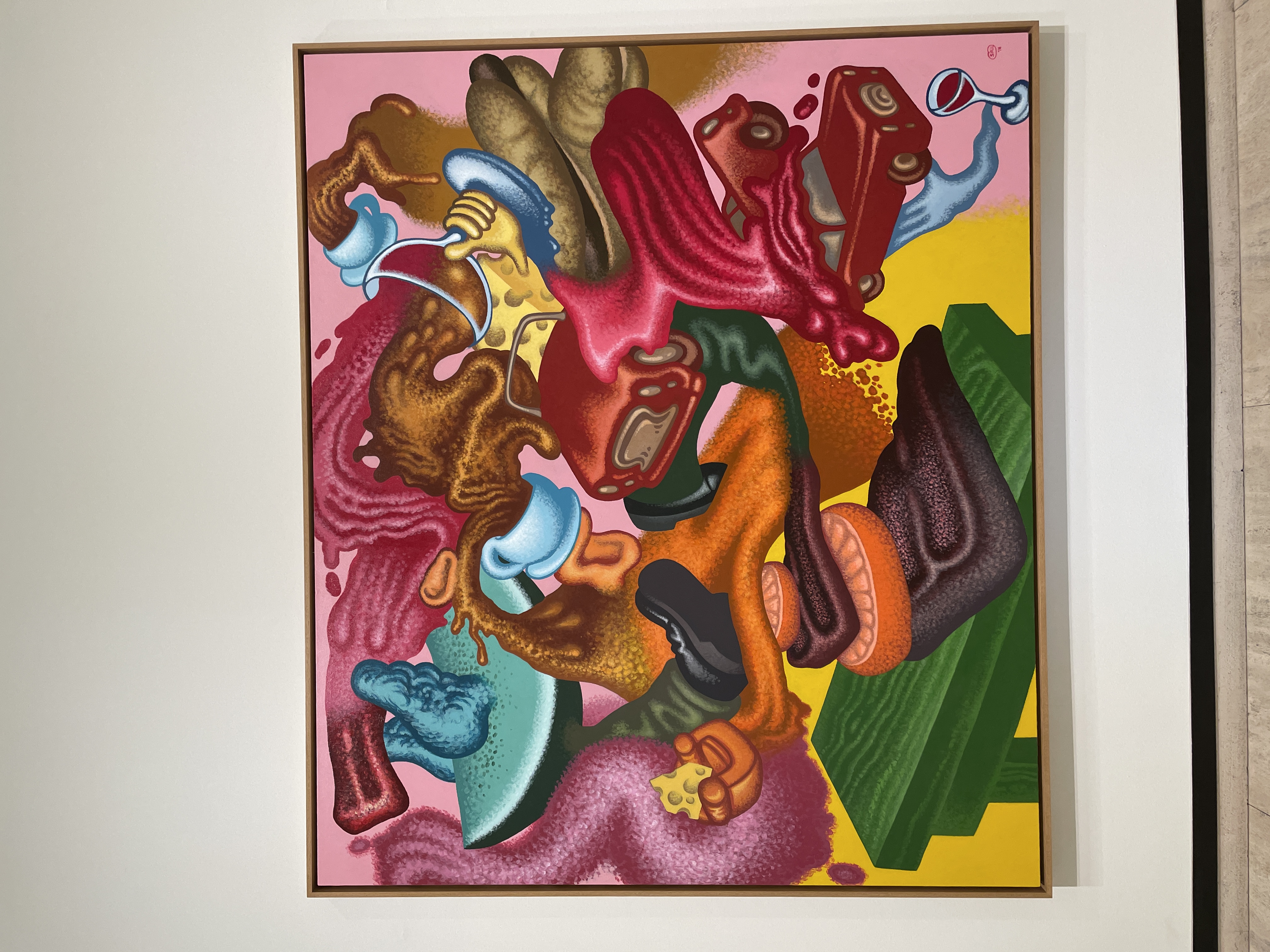
I recently visited the Sheldon Museum of Art in Lincoln, NE for my User Interfaces class. I was able to see so many interesting pieces of art! Our assignment was to find an art piece that inspires us and analyze it. I chose the painting Abstract Expressionist Still Life by Peter Saul. From the descriptions next to the painting, I learned that for the past six decades, Peter Saul has critiqued and satirized contemporary society, politics, and the art world using his exaggerated, cartoonish, and often acerbic imagery. He has never strayed from figuration; even in the late 1950s, when he began painting, he found abstract expressionism too cerebral. Despite having always considered himself an outsider, his pictures have influenced generations of younger artists, beginning in the 1980s during the resurgence of figurative painting in the art world. I’m choosing three areas to analyze this painting: “direction of the eyes,” “color balance,” and “repetition.”
Regarding “direction of the eyes,” the painting makes use of several swirling patterns all throughout it. My eyes naturally follow the smooth swirls, trying to see where it leads. According to Virtual Art Academy, to create eye movement in art, artists can repeat specific colors throughout the canvas, so the viewer’s eye moves from one spot on the canvas to another. Using specific brushwork patterns can help direct the eyes to where you want them to land. In this painting, the artist repeats a light blue color and pink throughout different spots on the painting. In each swirl, he also textures them so that there are lines going through it, and our eyes follow those lines.
According to the Artist’s Toolkit, balance can be achieved by adding a small amount of color to offset the visual weight of a large area of neutral values. Similarly, a small area of warm color can balance a large area of cool color. This painting achieves that when he adds light blue objects within the pink background, for example.
Lastly, with repetition, this artist repeats the same objects throughout the painting. The coffee mug appears twice, the car appears 3 times, the leg appears twice, etc. According to the Winged Canvas, rhythm is created when one or more elements of design are used to suggest movement. It uses repeated elements to create a path for the viewers’ eyes to follow. It helps create a mood and flow throughout the piece.
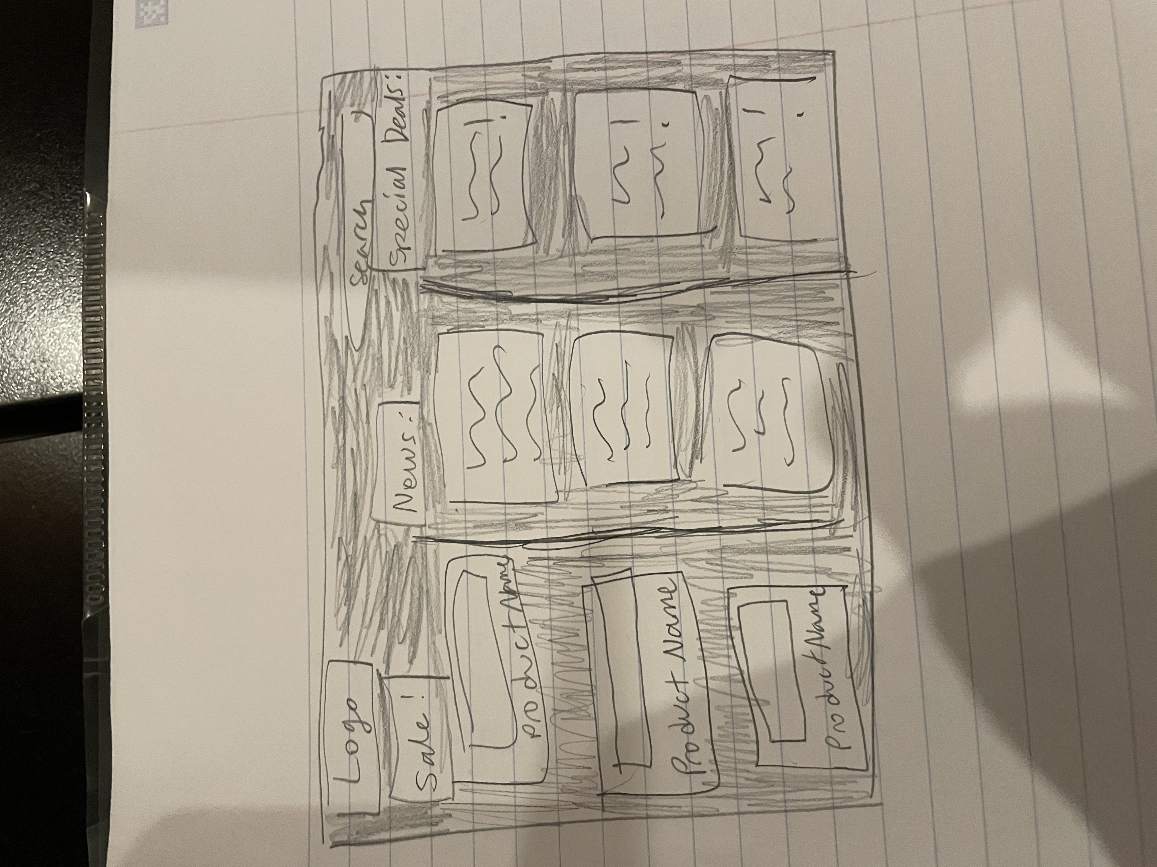
My sketch is the image above. It is a shopping website meant to be accessed through computers. I tried to incorporate “direction of the eyes” by making it so the viewers’ eyes move downward to look through everything in each section (Sale, News, and Special deals). I added the lines separating each section to achieve this. For color balance, I made the background dark and all the other elements lighter so there is a contrast and helps offset the visual weight. I also used repetition by making all the sections be a box object. This helps the viewers’ eyes flow smoothly through each section.
Through this process, I was able to learn that art has a lot in common with user interfaces. A lot of the design/visual concepts are shared between the two. With user interfaces, we have to use our creativity to make the interface pleasant and easy to look at.
Citations
https://www.virtualartacademy.com/eye-movement-in-art/, https://archive.artsmia.org/artists_toolkit/encyc_balancecolor.html#:~:text=Balance%20can%20be%20achieved%20with,image%20illustrates%20symmetrical%20color%20balance., https://www.wingedcanvas.com/single-post/rhythm-and-repetition-in-art-explained-the-principles-of-design#:~:text=Repetition%20is%20used%20to%20make,because%20there%20are%20repeated%20colours.